Every creative brief requires its own unique typographic solution to
achieve both individuality and visual harmony. This is why the question
"what's the best typeface combination?" is impossible to answer
succinctly. Typefaces are a bit like people; their personalities can
alter ever so slightly when you bring them together in different groups.
A stern Geometric san serif can act the part of a plain disciplinarian
when standing next to an equally restrained Transitional serif, but can
become light-hearted and playful when it encounters a lively Casual
script or a burly Slab serif face. Choosing typefaces that work well
together is ultimately as subjective as it is scientific, as personal as
it is informed, and as debated as it is agreed upon. The suggested type
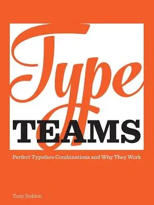
combinations illustrated throughout this book are designed to provide
the information and inspiration you need to make the best choices you
can when bringing typefaces together.
- A book for typographers, graphic designers, and font geeks alike.
- Type teams are compiled from a pool of two hundred handpicked typeface
families.
- Typefaces from over fifty world-class type foundries and type
designers.
- One hundred and forty nine type team combinations with up to four
individual typeface families utilized for each.
- Thirty two themed sections to allow quick access to the required mood
for your individual projects.
- Ten key principles to help you make the right typeface choices for
your creative assignments.
- Fourteen "tricks" to apply when selecting and combining typefaces from
your personal collection.

