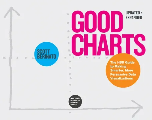
Your ultimate guide to data visualization and information design--the
new language of business.
The best, most powerful way to communicate the nature and potential
impact of data is visually.
For a long time "dataviz" was left to specialists--data scientists and
professional designers. No longer. A new generation of tools and massive
amounts of available data make it easy for anyone to create
visualizations that communicate ideas far more effectively than generic
spreadsheet charts ever could.
The companies that invest in improving their visual communication will
gain a competitive advantage, seeing threats and finding opportunities
others don't. For individuals like you, building good charts is a
need-to-have skill. If you're not doing it, other managers are, and
they're getting noticed for it and getting credit for contributing to
your company's success.
In this updated and expanded edition of Good Charts, dataviz maven
Scott Berinato provides the essential guide to how visualization works
and how to use this new language to impress and persuade. Berinato lays
out a system for thinking visually and building better charts through a
process of talking, sketching, and prototyping. From tips and tricks for
upping your visualization's clarity to laying out a system for
storytelling with data, Good Charts covers all the core skills you
need and can develop.
This new edition includes added visuals and updates the landscape of
visualization tools. It also includes new chapters on building dataviz
teams and creating workflows to integrate visualization into everything
you do.
Good Charts is your go-to resource for turning plain, uninspiring
charts and presentations that merely present information into smart,
effective visualizations that powerfully convey ideas.

