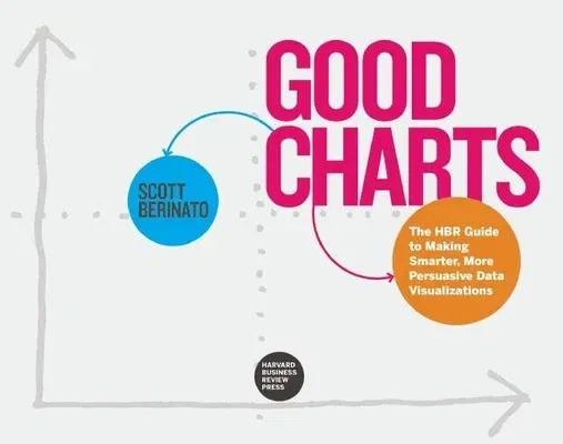
Dataviz--the new language of business
A good visualization can communicate the nature and potential impact of
information and ideas more powerfully than any other form of
communication.
For a long time "dataviz" was left to specialists--data scientists and
professional designers. No longer. A new generation of tools and massive
amounts of available data make it easy for anyone to create
visualizations that communicate ideas far more effectively than generic
spreadsheet charts ever could.
What's more, building good charts is quickly becoming a need-to-have
skill for managers. If you're not doing it, other managers are, and
they're getting noticed for it and getting credit for contributing to
your company's success.
In Good Charts, dataviz maven Scott Berinato provides an essential
guide to how visualization works and how to use this new language to
impress and persuade. Dataviz today is where spreadsheets and word
processors were in the early 1980s--on the cusp of changing how we work.
Berinato lays out a system for thinking visually and building better
charts through a process of talking, sketching, and prototyping.
This book is much more than a set of static rules for making
visualizations. It taps into both well-established and cutting-edge
research in visual perception and neuroscience, as well as the emerging
field of visualization science, to explore why good charts (and bad
ones) create "feelings behind our eyes." Along the way, Berinato also
includes many engaging vignettes of dataviz pros, illustrating the ideas
in practice.
Good Charts will help you turn plain, uninspiring charts that merely
present information into smart, effective visualizations that powerfully
convey ideas.

